Why is Excel’s old logo still being used?

The current Excel logo was introduced in 2019, making it already half a decade old!
On the Windows desktop version, you’ll see it in several places, most notably as the app icon in your Start menu, taskbar, and on the desktop.
It also appears in the top-left of the Excel, Power Query, and Power Pivot windows.
However, guess which one of these is the anomaly?
That’s right — the Power Pivot window. For some reason, the logo you see there is the one that reigned from 2013 to 2019.

I remember Power Query being very slow to update long after the new logo first came about, although it did eventually catch up.
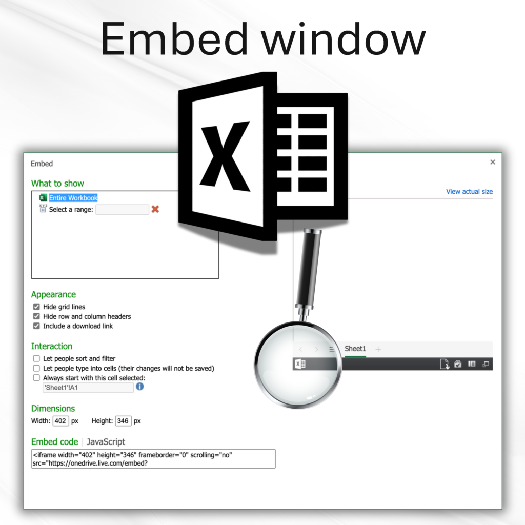
There’s another place that’s affected: the Excel for web Embed window. This is what pops up when you go to File > Share > Embed > Generate.

Interestingly, this black-and-white version is slightly different from the coloured one, as it has only four whole rectangular blocks rather than five.
Perhaps only I noticed.
Nevertheless, is there an explanation for any of this? I mean, you’d think updating the logo would be a piece of cake. However, sometimes these seemingly simple tasks can be met with all kinds of stumbling blocks.
If you look at Excel’s logo history, the average tenure for each is about four years. That means if there’s any new design within the next couple of years, it’s going to make the old ones look even more out of place.
