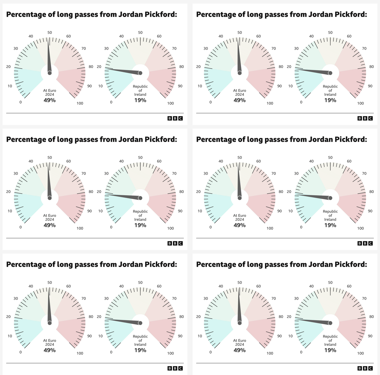
I’ve never seen the BBC use this chart before — until now

Whilst reading an article about England’s 2–0 win against the Irish yesterday, I came across a couple of charts I’ve not seen the BBC use before.
Gauge charts — aka dial charts, speedometer charts, or meter charts.

They were used to visualise the percentage of long passes made by Three Lions goalkeeper Jordan Pickford compared to Euro 2024.
These aren’t static, either. They have this really cool needle-jitter effect, which is a nice touch.
Gauge charts aren’t actually a standard out-of-the-box chart type in Excel. They can only be created by combining a Pie and a Doughnut.
Nevertheless, it’s nice to see other kinds of visualisations being used rather than seeing yet more bloody boring bar charts. 😫
On that note, it would be good if the Windows and macOS emoji libraries were updated to include a broader range of visuals. All we really have are three — a bar chart (📊) and two line graphs (📈 & 📉). 🤷🏻♂️
