Make mini bar charts in Excel

Full-scale charts can clutter a worksheet, which is why in-cell charts are helpful — they save space while still letting you scan data quickly.
Excel offers options like Sparklines and Data Bars, but they can clash with values and often require wider columns.
A simple alternative is to build the bars with a single formula.
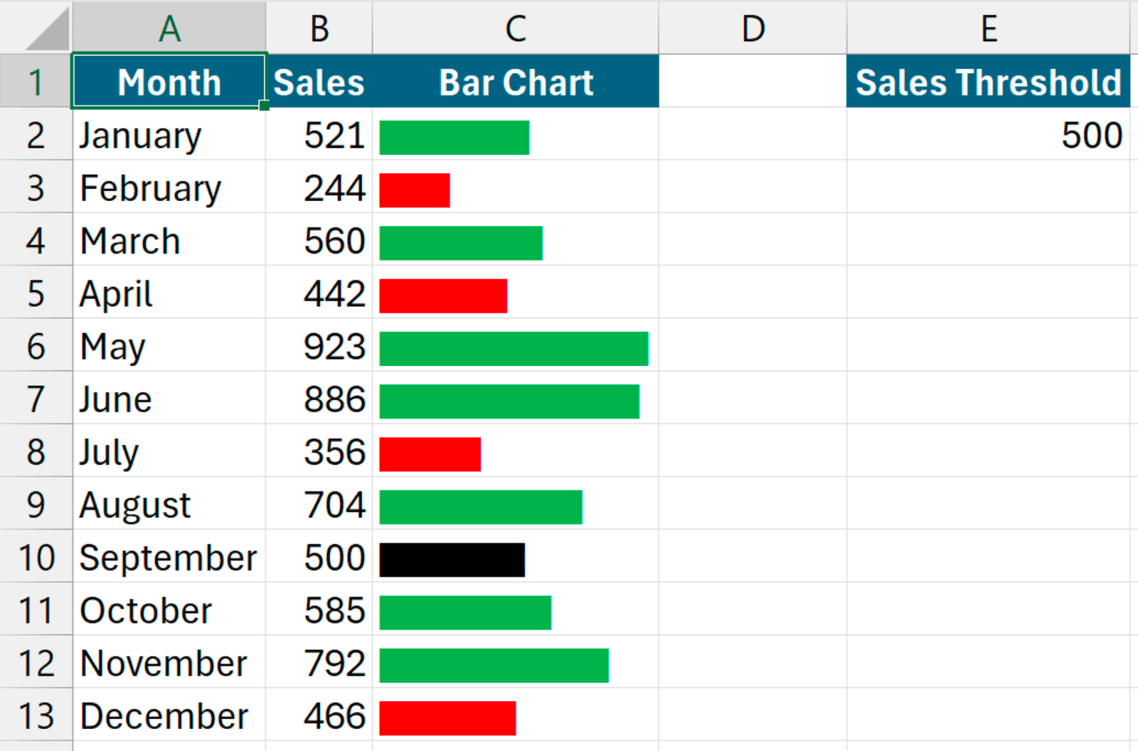
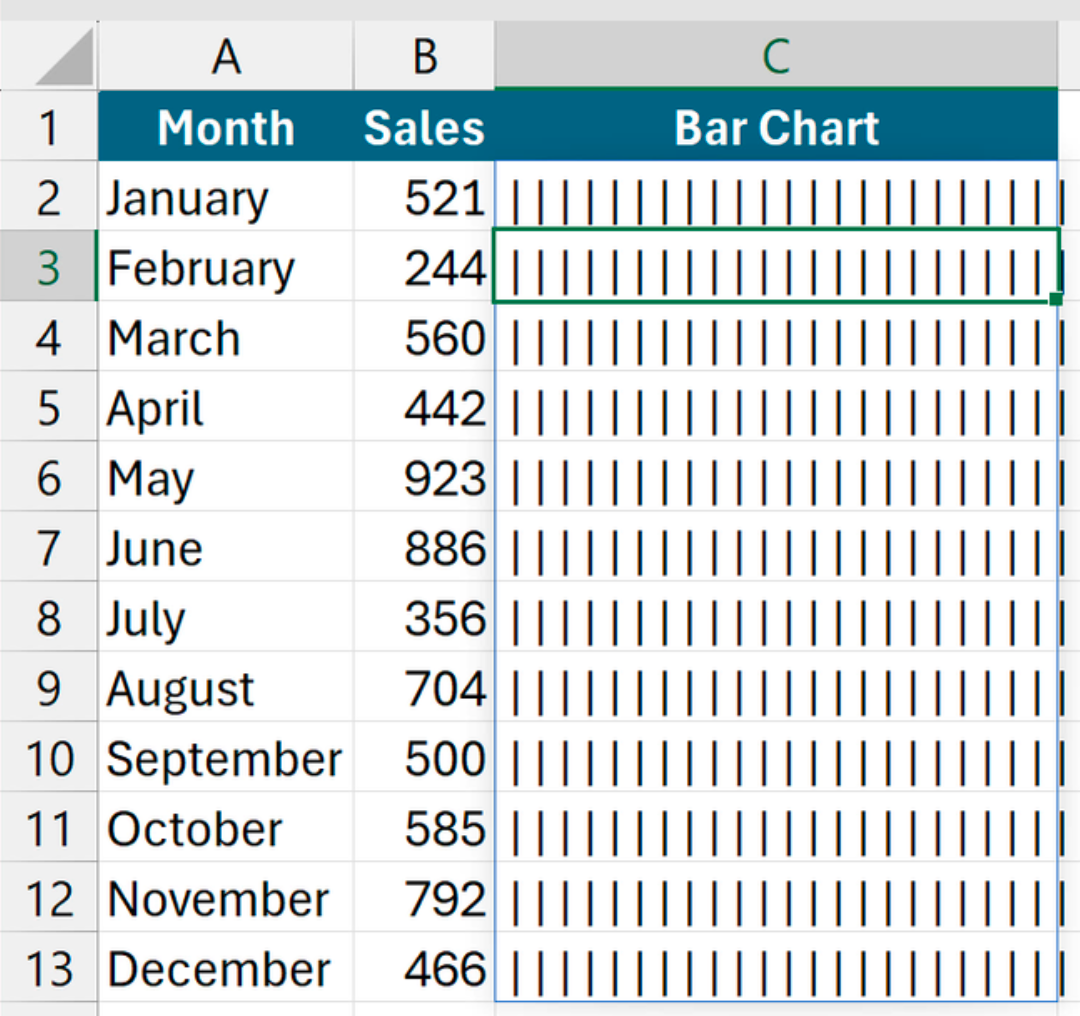
With sales figures in B2:B13, putting =REPT("|",B2:B13) in C2 repeats the pipe character according to each value.
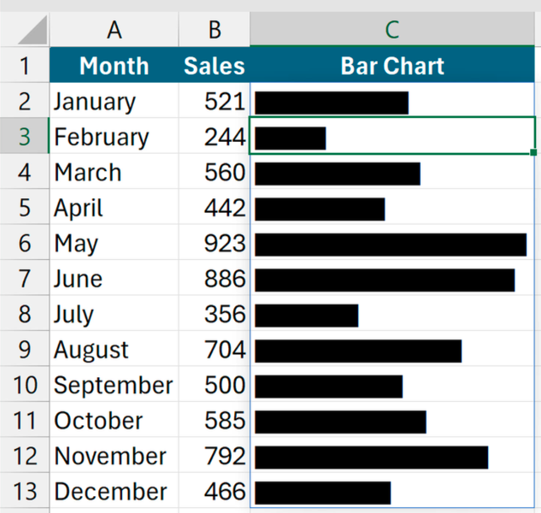
Switching the font to Stencil turns those pipes into solid bars, and dividing gives you control over the bar length. For example, =REPT("|",B2:B13/15).
You can go one step further by adding a threshold value (E2) and applying conditional formatting rules: green if the value is above the threshold (=$B2>$E$2), and red if it’s below (=$B2<$E$2).