I’ve just discovered a new chart, and it’s well-suited to politics
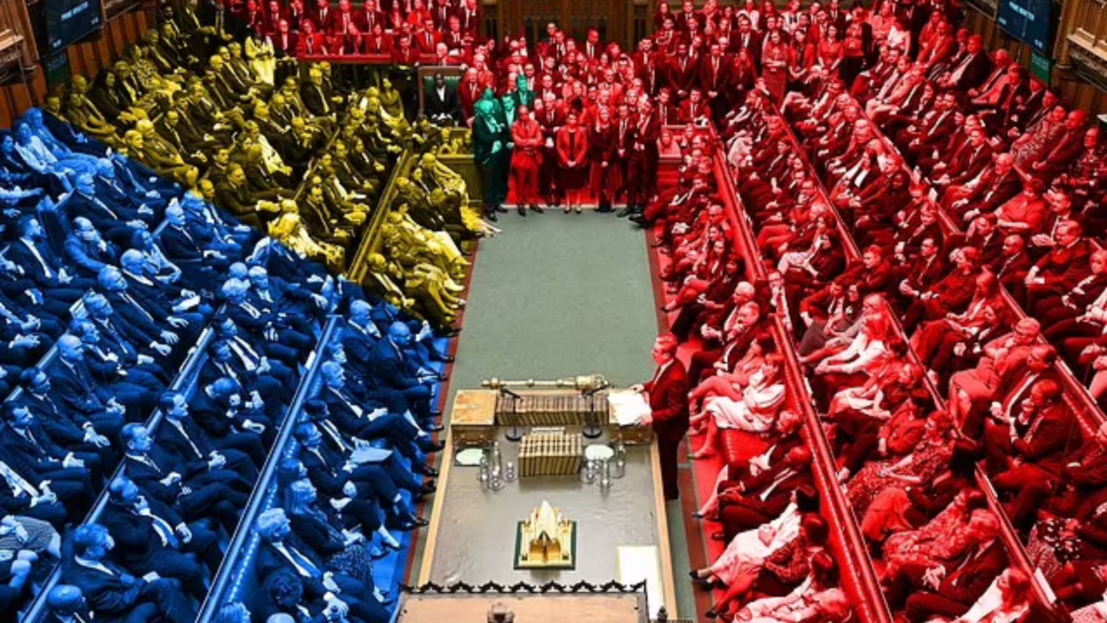
Here’s a chart Excel needs: a cartogram.
It’s a type of map that represents geographic regions with shapes sized according to a specific data variable rather than their land area, which can affect the interpretation of a result.
If you’ve been following the UK general election in the last few days, you might have bumped into one of these on various news websites. It’s offered as an alternative to the standard map view.
Every source I’ve seen, whether BBC News, Sky News, or The Guardian, opts to represent each constituency winner using a hexagonal polygon filled with the party colour.
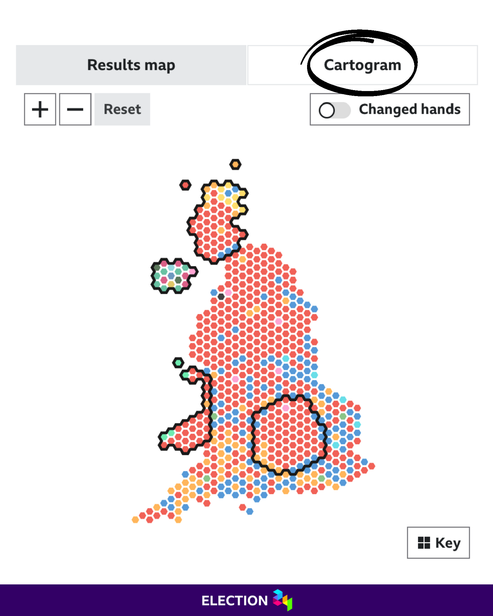
Have a look at BBC News’ election graphics below.
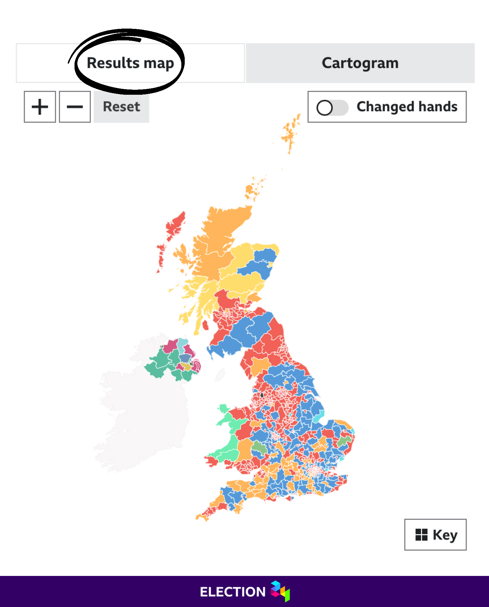
If you had no prior knowledge about UK politics, a quick glance underneath the default Results map tab is bound to make you think Conservative won the election based on blue appearing to be the most common colour overall.
However, a different conclusion emerges when you click on the Cartogram tab. Suddenly, with all things being equal, a sea of Labour red dominates.
This can make the standard map deceptive when determining the final result.
Why is this?
The explanation is quite simple. Conservative-run constituencies tend to be more rural, have larger land areas, and sparser populations. On the other hand, Labour ones tend to be more urban, have smaller land areas, and denser populations.
Quick fact: London has 75 constituencies alone!
Measuring results by colour
I snapped a couple of screen grabs and pasted them into ChatGPT to accompany my written request for a colour breakdown of each graphic. I asked for the colour name, HEX code, and pixel count — it returned the top 10 colours.
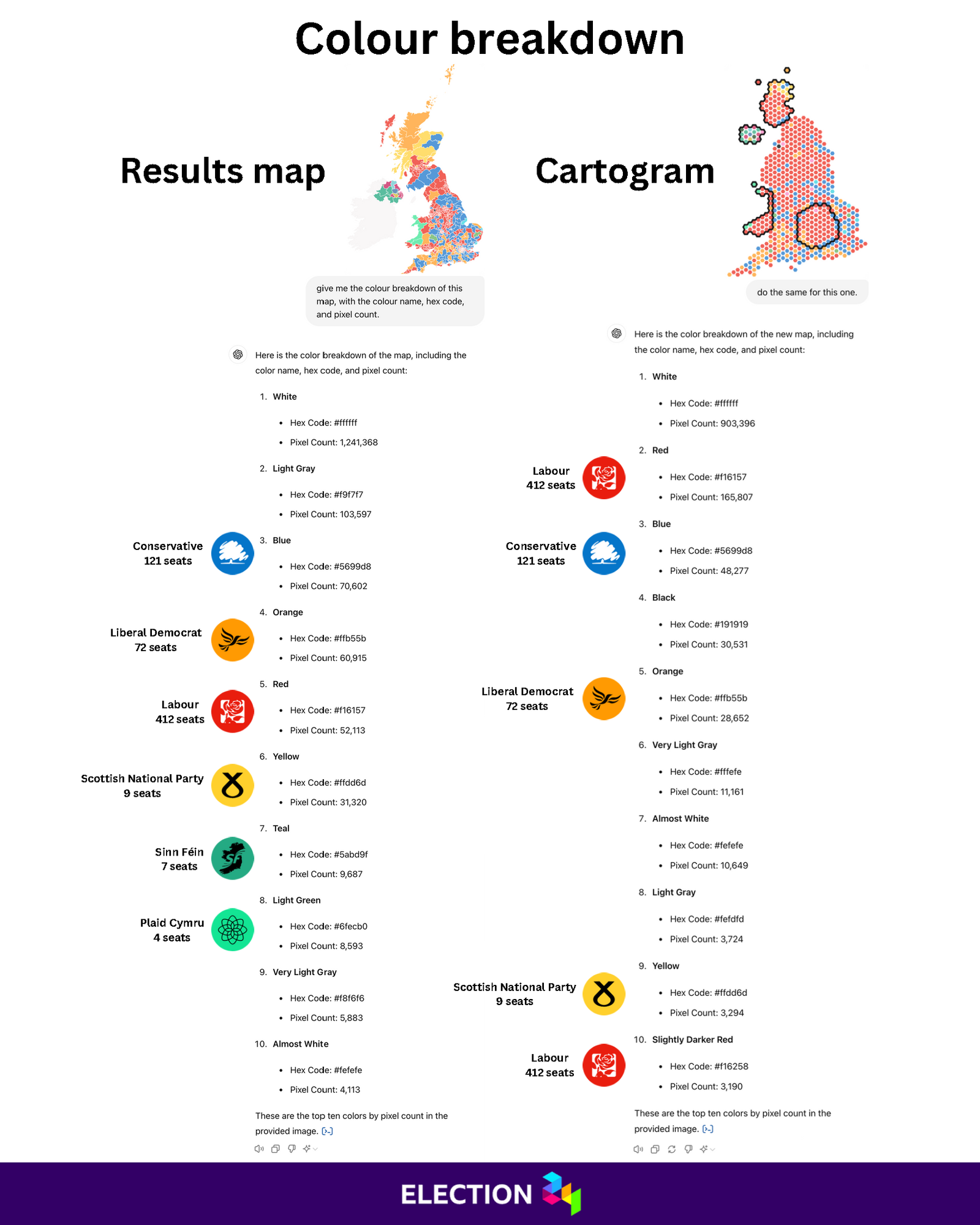
Ignoring the irrelevant colours in the image (the whites, blacks, and grays), blue (Conservative) predictably represents the highest pixel count in the results map.
But despite picking up 340 fewer seats than Labour, the Liberal Democrats are above them in this list, helped by winning two huge constituencies in the Scottish Highlands.
The cartogram results paint a much clearer picture. In fact, the order of the top four parties pixel-wise directly correlates with their actual seat counts.
That’s what you’d expect, right?
The only noticeable error ChatGPT made was detecting 3,190 pixels in an almost undetectably darker shade of red. Maybe this wasn’t an error — I don’t know. Given the humongous pixel count of the first Labour entry, it’s all rather academic anyway.
Final words
What’s clear from this experiment is you should never try to determine an election result just by looking at an ordinary map.
Excel’s current map chart works pretty well for basic needs. However, although it can handle a certain amount of granularity, it can’t display constituencies, limiting how election data can be visualised.
It would be nice not only to see more advanced map charts but also cartograms!
