Analysing 10 Million Rows in Excel

Big data is a term used since the early 1990s to describe “huge, overwhelming, and uncontrollable amounts of information”. The rapid rise of the internet has meant the volume of data has increased exponentially over the past two decades.
There is no universal threshold determining where big data starts. However, it’s generally considered to kick in at the point where traditional tools struggle to meet the demands of processing a dataset.
Of course, this is highly subjective. What is colossal to small and medium-sized businesses is minuscule to multinational corporations.
In Excel’s case, the limit is 1,048,576 worksheet rows, although you probably wouldn’t want to get anywhere near that if you wanted a lag-free experience.

Swathes of data scientists, data engineers, and even data analysts, scoff at the idea that Excel can have any role in the big data world. What many don’t realise though is there is something very powerful but lacking an ostentatious presence.
It’s called Power Query.
Power Query is a data transformation and data preparation engine, which first appeared in Excel 2010 as an add-in. Fast forward to Excel 2016 and it become integrated into the Data tab without the need to install anything additional.
This article debunks the myth Excel can’t handle more than a million rows by demonstrating a step-by-step method of connecting to a very large dataset. Pivot tables and charts are also constructed to get a feel of the data.
Scenario
Just imagine you’re an office administrator who’s been sent a ginormous 1.14GB CSV file containing 10 million records of adult census data. You’ve been asked to inspect it and provide a summary.
Quick caveat: this data is fictional and should not be used to draw real-life conclusions.
Although you’re an intermediate Excel user with plenty of experience stringing together reports, never have you had to deal with data on this scale, however.
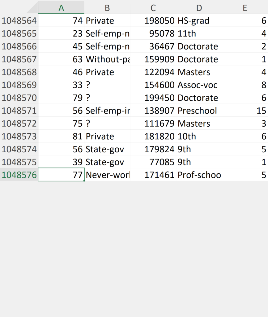
Usually, you’d open the CSV file directly in Excel and immediately crack on with the rest. The issue is when you try to do that with this, an error message pops up warning you it’s too large for the grid.

You then scroll to the bottom to find the data has indeed been truncated with 7,951,424 missing records.
Oops.
At your workplace is a data scientist who’s the go-to guy for all things data. For alliteration’s sake, let’s call him Paul—Paul the programmer.
There he is—sat in the corner of the office geeking it out on his ultrawide quad monitor setup. Due to the nature of your work, you rarely need to converse with him, but you know he’s a Python, SQL and Hadoop guru. In fact, he’s the only one there.
With his wealth of knowledge, you think it would make sense to send over the CSV file for him to generate a few visualisations. However, he’s got enough on his plate. He could do without people like you pestering him with more tasks.
Paul is an Excel-skeptic who’s been known to belittle it. However, he’s barely used it since school and believes the majority of data crunching and analysis should be carried out in Python.
“This dataset is far too big for Excel, period,” he bullishly informs you. He sounds convincing — he even sounds cocksure. Little do you know, he’s not well-versed in the program, but given his status, you assume he knows what he’s talking about.
Paul tells you he’ll do it, but only after completing a few other tasks on his checklist. That could mean waiting two or three days — maybe longer.
There are two problems here:
- Before asking Paul, you didn’t bother Googling, posting on forums or social media to find out if there was a way of doing it in Excel or another program (eg. Power BI or Tableau).
- Is Paul even being honest? Perhaps he knows more than he’s letting off but is reluctant to say because he doesn’t want to undermine his role. After all, he wants people to depend on him. If he starts empowering others by dishing out advice willy-nilly, it might lessen the chances of getting that pay rise from the boss.
At this point, you think relying on him is the only option. If only you knew the alternative—then you wouldn’t think twice about taking matters into your own hands…
Solution
To circumvent the million-row limitation, it’s possible to load a dataset into Excel without dumping it onto a worksheet.
Firstly, go to the Data tab and inside the Get & Transform Data section click on From Text/CSV.

This opens File Explorer, allowing you to select the CSV file.

A preview window then pops up so you can get an overview of the data.
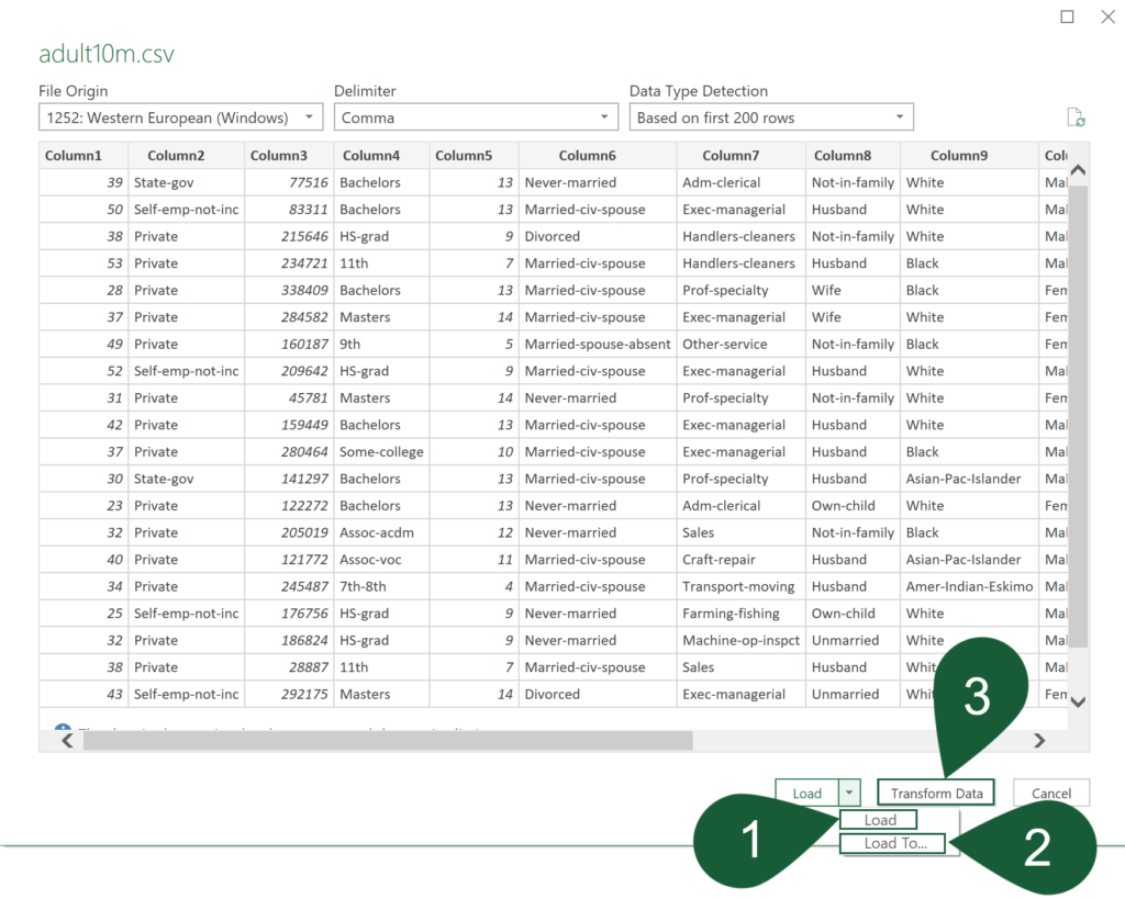
For this exercise, transform the data first (option 3) and click the Close & Load To… ribbon button for the Import Data window (option 2) to pop up. Choose Only Create Connection and check the Add this data to the Data Model box. Press OK to confirm the choices.
The options are:
1. Load
Loads the data directly into the worksheet as a query. However, in this case, a warning will appear alerting you that the query returned more data than will fit on the worksheet. Therefore, only the first 1,048,576 rows will show.

2. Load To…
The Import Data window pops up, presenting you with a few choices.
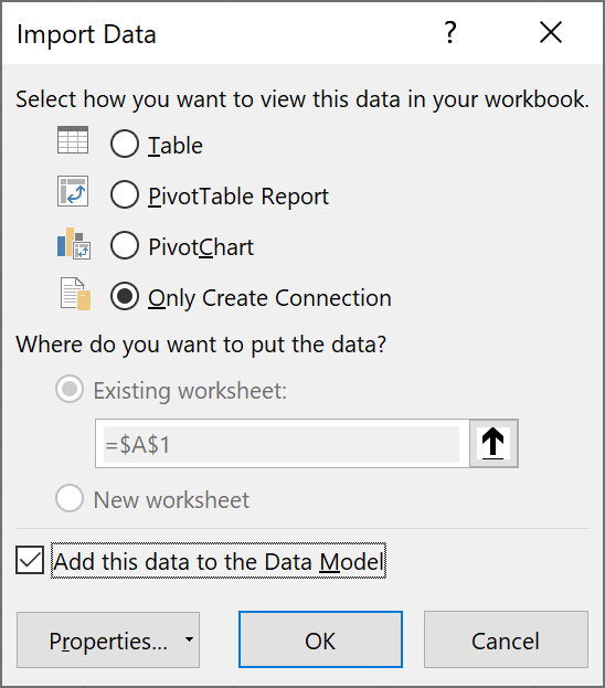
- Table—same as Load and should not be used here for the aforementioned reason.
- PivotTable Report—connects to the data source and generates a pivot table.
- PivotChart—connects to the data source and generates a pivot chart.
- Only Create Connection—connects to the data source only.
- Add this data to the Data Model—if you plan to use PowerPivot, check this box.
Choosing Only Create Connection and leaving Add this data to the Data Model unchecked means you are dependent on the source file. If it is moved or deleted, Excel won’t be able to connect to it until you provide an updated and valid directory in Power Query.
In contrast, enabling Add this data to the Data Model stores the dataset inside the Excel file so isn’t dependent on the file. It will, however, increase the workbook size substantially (~76MB), but that’s still a far cry from what the CSV file is itself (1.14GB).
Adding to the Data Model also allows you to carry out sophisticated modelling with Power Pivot. An example of a DAX formula is shown later.
3. Transform Data
Opens the Power Query window so the data can be transformed and prepared.
If you’re new to Power Query, check out the tutorial on How To Excel.
As the dataset comes with no column names, they are automatically generated (eg. Column1, Column2, Column3, etc.), although it is better to rename them something more meaningful.
On the Adult Data Set webpage, the attribute names are listed in column order.
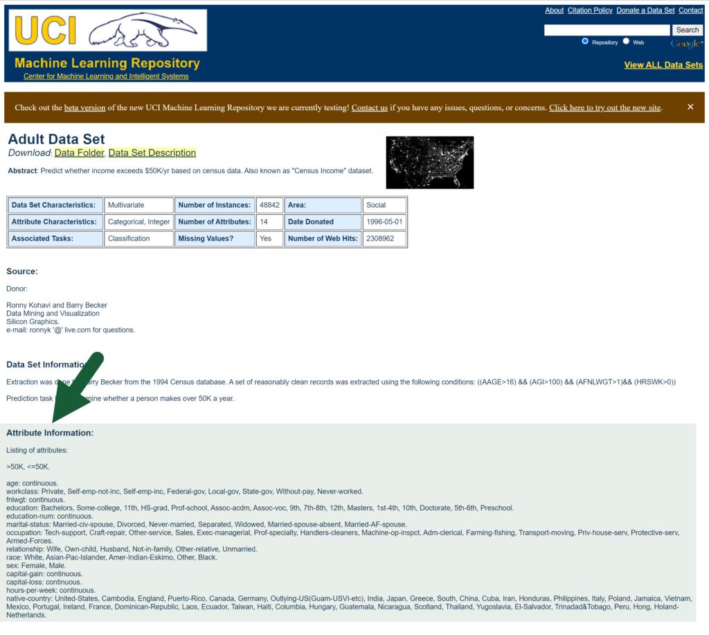
Double-click on each column heading to rename it to the respective attribute. Once done, press the Close & Load button.
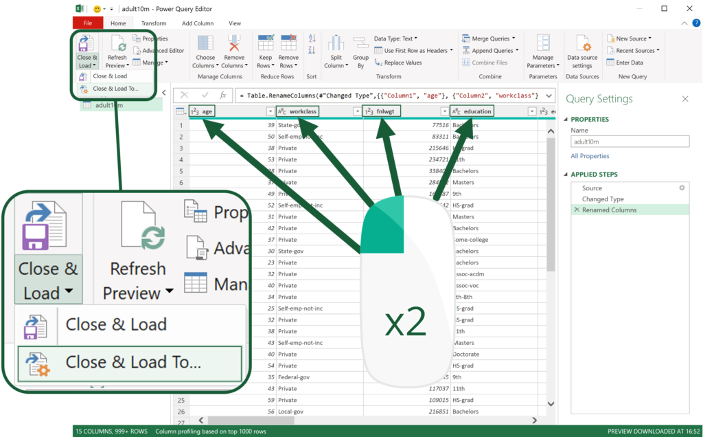
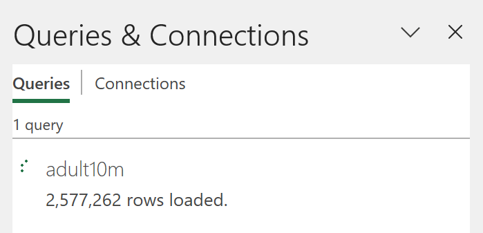
The query appears in the right panel showing the data is loading. It’ll take a few minutes to complete.
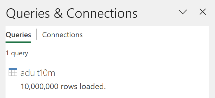
After it’s finished, you’ll see all 10 million rows have been loaded.
Go to Insert (tab) > PivotChart (dropdown) > PivotChart & PivotTable (button).

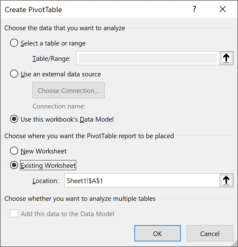
In the Create PivotTable window, ensure the Use this workbook’s Data Model radio button is selected. You can also choose where you want the PivotTable report to be placed.
Click OK.
At this stage, you’ll see a side panel containing the adult 10m data source and an empty pivot table and chart on the worksheet. Click on either to unveil the PivotTable Fields panel.
Now you can start your analysis!
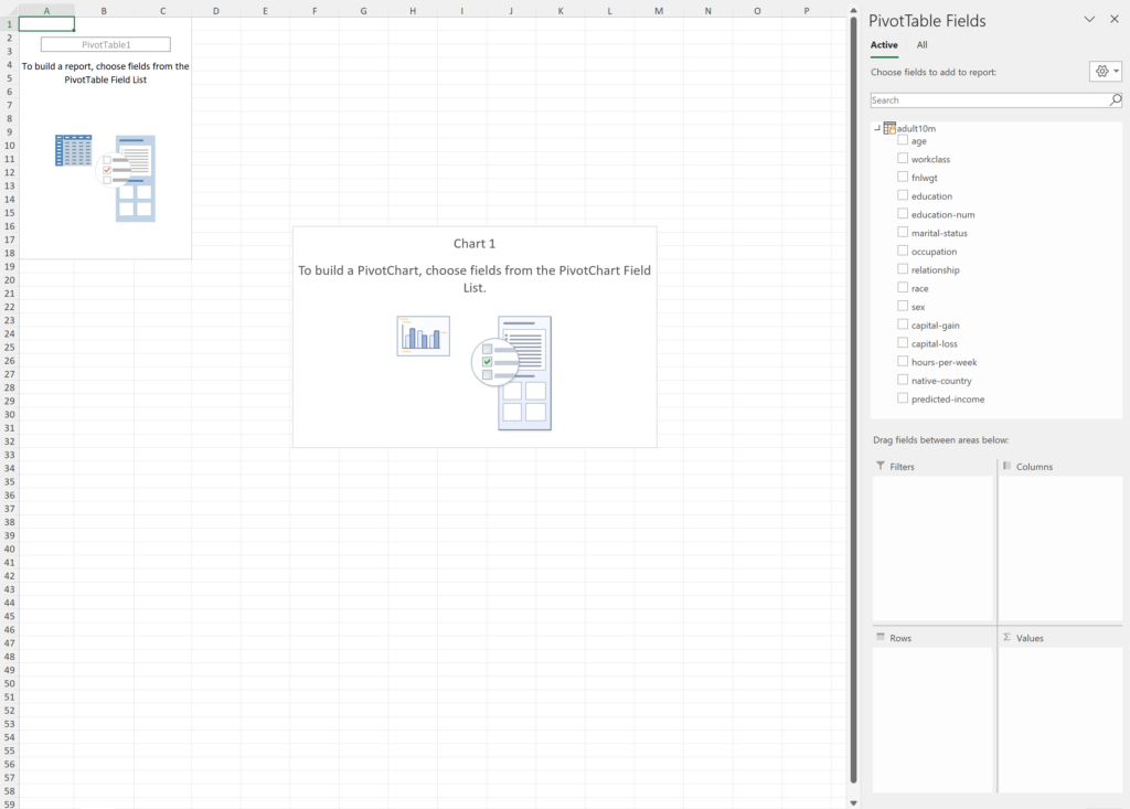
This isn’t the place to show you the ins and outs of pivot tables, but let’s quickly run through the basics.
If you’re new to pivot tables, check out the tutorial on Exceljet.
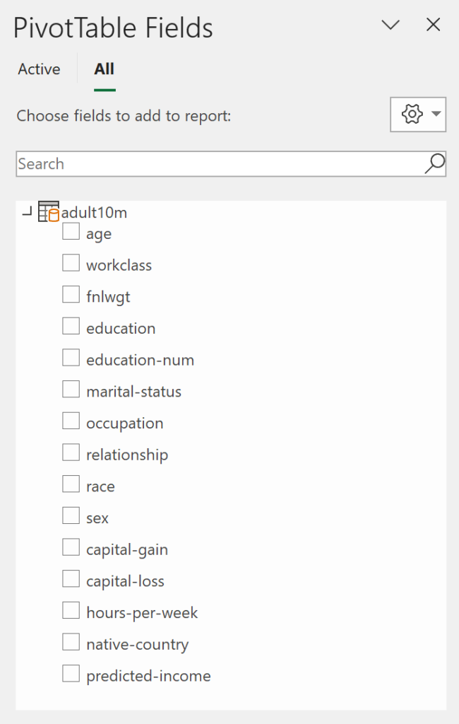
At the top of the panel are the field names, which are added to any of the bottom four sections. If the pivot table is active, you’ll see Filters, Rows, Columns and Values. Rows and Columns will display as Axis (Categories) and Legend (Series), respectively, when the pivot chart is active. In any case, it won’t make a difference.
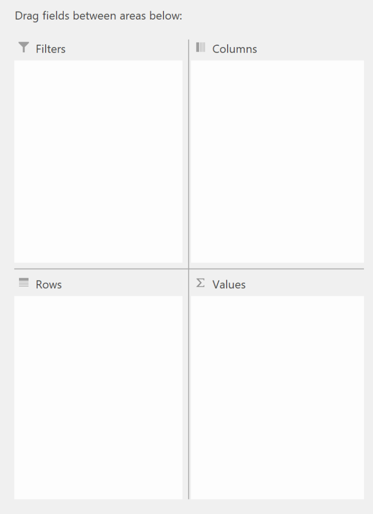
- Filters — adds a dropdown with a list of categorical choices based on the field’s values. These can be turned on or off via the checkboxes to adjust the table/chart accordingly.
- Rows/Axis (Categories) — groups a field’s values into categories and adds them to the table as rows and the chart’s x-axis.
- Columns/Legend (Series) — groups a field’s values into categories and adds them to the table as columns and the chart’s data series.
- Values — displays a field’s values in the pivot table/chart.
Either tick the checkbox next to the field name you want to see in your pivot table/chart — or drag it into the appropriate box. If you tick a checkbox, notice how numeric fields appear in Columns and Values, whereas text ones show up in Rows. This isn’t always what you want, so often it’s better just to drag them in.
To remove a field from the pivot table/chart, untick the checkbox or drag the field out of the box.
Pivot Table/Chart Examples
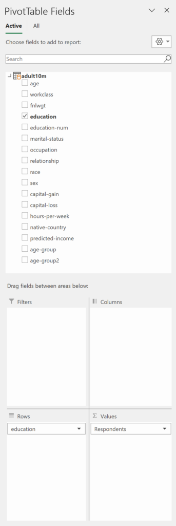
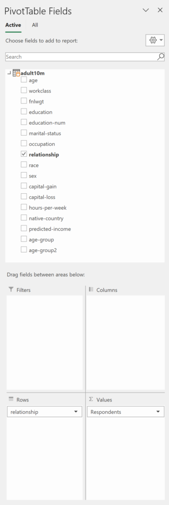
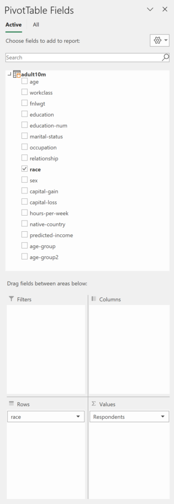
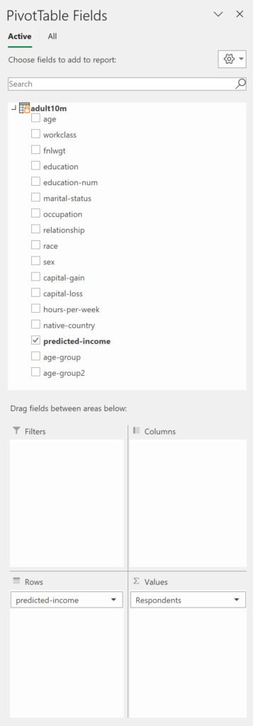
Let’s generate a few tables and charts to gain insight into the data. Each example features the table and chart as well as the field selections, so you know what they consist of.
Sex of Respondents
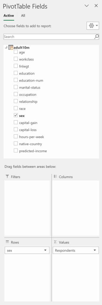
Shows the breakdown of census respondents by sex.
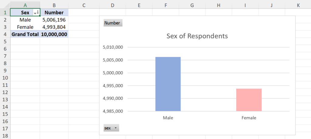
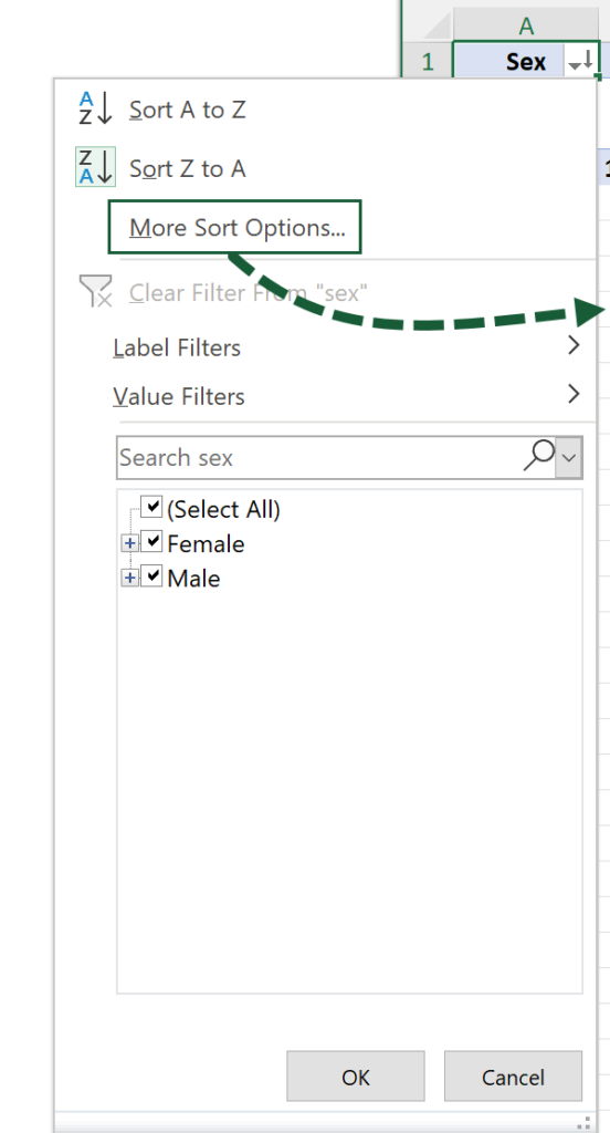
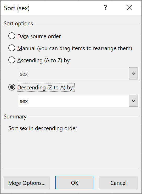
Put the table in ascending or descending order by clicking on the AutoSort button and selecting the desired option. This will only sort the first column, but More Sort Options… opens a popup window allowing you to order by any column.
Feel free to rename the default column headings to make them more appropriate. For example, instead of Count of sex, use Respondents.
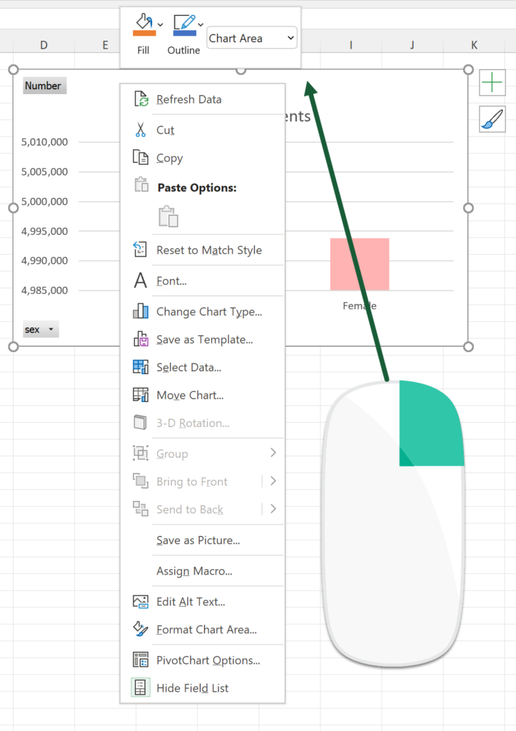
Access the data and formatting options by right-clicking on the chart. You can also decide whether certain elements should display or not by pressing the plus symbol in the top-right.
Age of Respondents
Shows the breakdown of census respondents by age.
The technique you just saw could be applied to this, except you’ll end up with a rather lengthy table and wide bar chart.

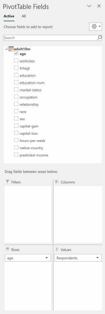
It’s better to group the ages so you have far fewer categories. Power Query or Power Pivot can be used to achieve this.
Let’s start with the Power Query method.
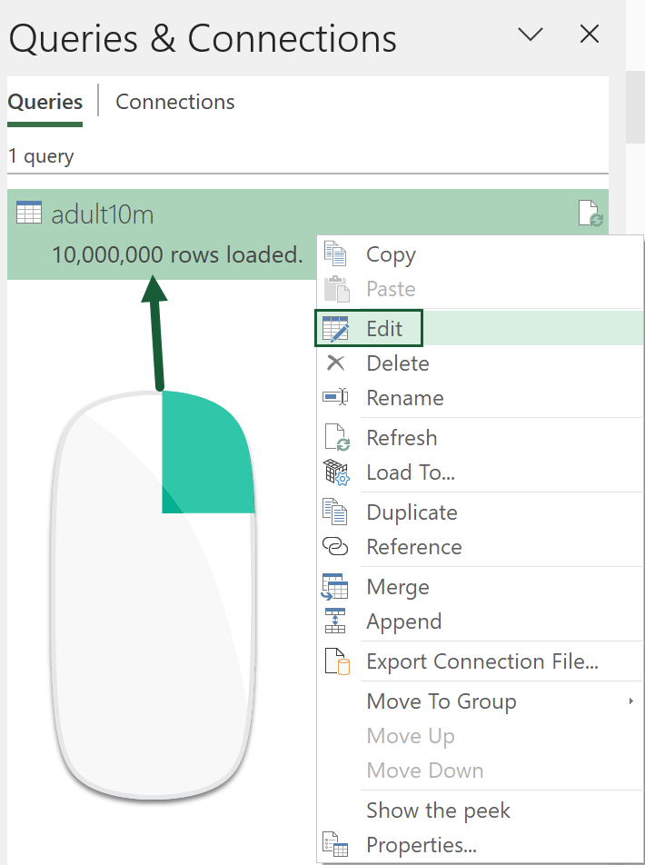
Go to Data (tab) > Queries & Connections (button).

In the side panel, right-click on the adult10m query and select Edit to open Power Query.
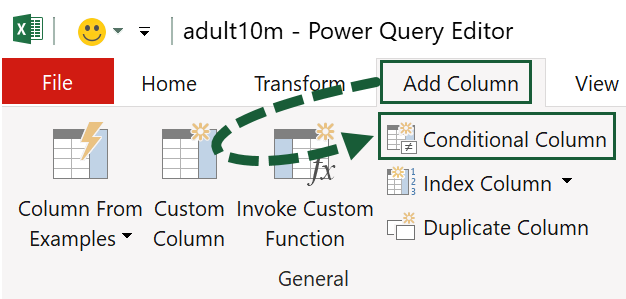
Create a conditional column by going Add Column > Conditional Column.
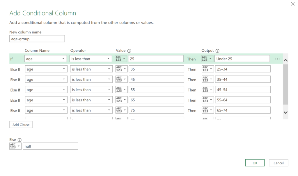
The Add Conditional Column window opens, allowing you to set the age groups. They are:
- Under 25
- 25–34
- 35–44
- 45–54
- 55–64
- 65–74
- 75+
Give the column a name, press the Add Clause button to add each condition, and fill them in as shown. Then press OK.
The step you just created is added to the Applied Steps list.
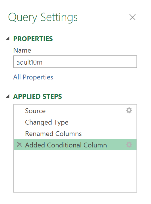
Click Close & Load to update the query.
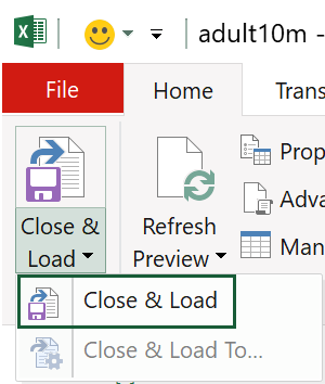
Notice how Close & Load To… is greyed out this time. That’s because the query has already been loaded in, so it will only be clickable the first time around.
Create another pivot table/chart or edit the existing one. The new field name age-group will now be visible in the panel.
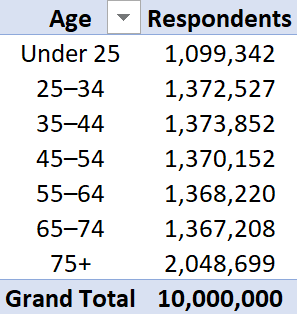

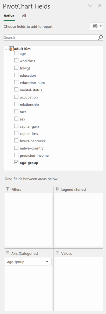
Now, let’s look at how to achieve this in Power Pivot with a DAX formula.
If you’re new to PowerPivot, check out the tutorial on Computergaga.
Go to Data (tab) > Manage Data Model (button).

Double-click on Add Column and name the column age-group2.

With the new column selected, enter the following in the formula bar:
=SWITCH(
TRUE,
[age]<25,"Under 25",
[age]<=34,"25–34",
[age]<=44,"35–44",
[age]<=54,"45–54",
[age]<=64,"55–64",
[age]<=74,"65–74",
[age]>=75,"75+"
)
DAX formulas strike a bearing resemblance to their Excel counterparts, and in many cases are interchangeable.
This SWITCH formula would also work in the Excel formula bar without any adjustments. Of course, you could just nest multiple IF statements, but when you have several categories, the SWITCH method is neater.
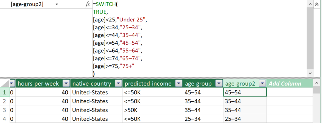
Close the Power Pivot window to see the field list has been updated to include age-group2.
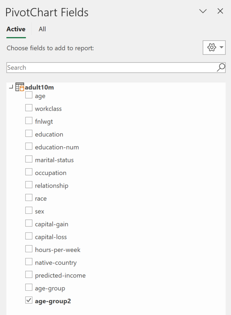
Whilst there are many crossovers between Power Query and Power Pivot, if something can be achieved in the former, the rule of thumb is to use that as the first port of call.
Other Examples
Here are a few other examples to further understand the data.
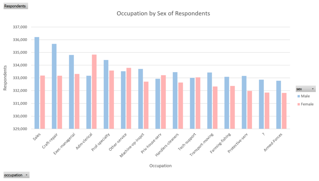
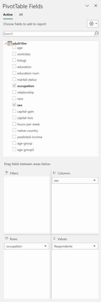
Occupation by Sex of Respondents
Shows the breakdown of census respondents by their occupation and sex.

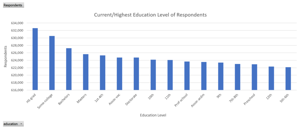
Current/Highest Education Level of Respondents
Shows the breakdown of census respondents by education level.

Relationship Status of Respondents
Shows the breakdown of census respondents by relationship status.


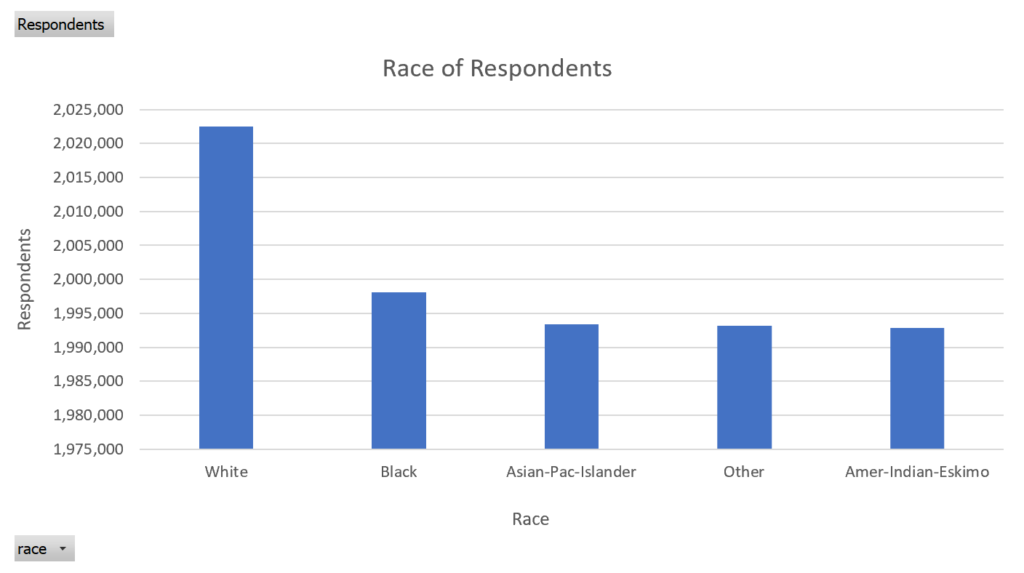
Race of Respondents
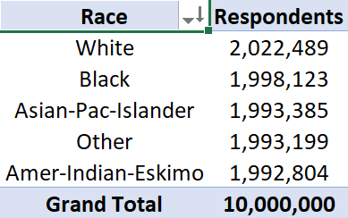
Shows the breakdown of census respondents by race.
Native Country of Respondents
Shows the breakdown of census respondents by native country.


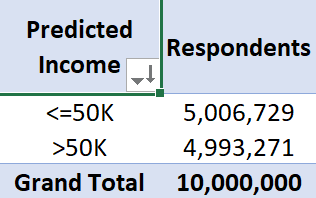
Predicted Income of Respondents
Shows the breakdown of census respondents by predicted income.

Final Words
Although I showed you how to load in 10 million rows, it could have been 20 million, 50 million, or 100 million. In theory, there is no limit to what the volume of data can be, whether you’re connecting to the source via Power Query or loading it into the Data Model.
However, you are limited by your computer’s specifications. A more powerful computer won’t only take less time to load, but it will be able to handle a lot more without the risk of crashing.
This is something I will be testing in due course. Stay tuned for that.

